12 Common Reasons People Usually Leave Your Website
Ever wonder why people are leaving your site? Or why your bounce rate is so high?
You’ve tried to do everything you can to grab their attention, but it just does not seem to be working. Your efforts are not getting you the results you want.
Visitors are continually clicking away. Why? What can be done?
Clearly first impressions matter and you’ve only got a few seconds to make a good one.
Here are 12 common reasons why they may be clicking on the red ‘X’.
Why People Are Leaving Your Site
1. Slow Loading Pages
Page loading is definitely one of the top reasons people leave a site. User expectations are high and therefore every second counts. Visitors just don’t want to wait for a slow loading site.
KISSmetrics recently wrote about the importance of load times. Here are some stats they reported:
- 47% of consumers expect a web page to load in 2 seconds or less.
- 40% of people abandon a website that takes more than 3 seconds to load.
- A 1 second delay in page response can result in a 7% reduction in conversions.
Not to mention, Google had admitted to using site speed in web search ranking, as faster sites tend to create happier users. If that’s not enough to make you reconsider the size of your pages, Google also recently announced that more Google searches take place on mobile devices than on desktop, where spotty internet connections and slow data speeds make it even harder to load large page sizes.
Remedy this by ensuring that your images are optimized, use a caching plugin, add lazy loading, enable compression, etc. Use Google’s PageSpeed Insights to see where the issues are and follow their suggestions for improvements.
2. Too Many Ads
Wanting to make money is one thing, but scaring off potential customers because of ad overload won’t serve you in any way.
Alex Bashinsky recently discussed Nielsen’s 2014 Trust in Advertising report which revealed that survey participants trust nearly all forms of traditional advertising — including newspaper ads, magazine ads, billboards, radio ads and infomercials — more than they trust online banner ads. Here’s the breakdown on the extent to which those surveyed trust different forms of advertising:
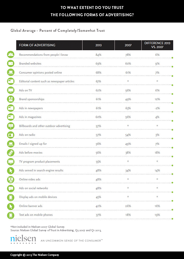
Image Credit: The Nielsen Company
He continued to say that “Since trust is a key component to driving conversions, limit the number of ads you use and the locations where they’re displayed. Ads shouldn’t be the first thing visitors see, and they shouldn’t take up more of your site’s real estate than its actual content.”
3. Poor Design
Every few years there seems to be a significant change when it comes to design and users expect website owners to be up to date. If your site looks like it is from the stone age then visitors perceive that it is out of date and not relevant.
Remember, design is the first thing they see when they come to your site so it needs to make a good impression.
Here’s what Joel Lumon Black from Black Bear Design thinks.
If visitors find your site crappy, they may never consider doing business with you even though you may have superior products.
Most visitors lose interest in your business when they find your homepage is poorly designed and just filled with a lot of text. The “wow” factor in web design retains visitors on your website and in the process, gives you the chance to relay your intended message.
Your website is the online gateway to your business and therefore, good design should be a priority. The quality of the website will determine whether visitors will stay or leave your site. Treat you website as the first branding for your business.
Would you stay or leave this site?

Image Credit: Black Bear Design
4. Site is Not Optimized for Mobile
The number of users accessing the web via mobile devices has grown exponentially over the past few years. If your site is not accommodating this change it does not really matter how good your content is.
It’s incredibly frustrating to try to navigate a site that does not fit ones screen. Not to mention the constant need to zoom in and out. Make the user experience enjoyable on any device.
You may have heard of ‘Mobilegeddon’, Google’s latest search algorithm update. This update means that sites that aren’t optimized for mobile are likely starting to receive less search engine traffic.
That isn’t the only danger with a non mobile-friendly site though; sites that aren’t optimized are likely receiving extremely high bounce rates given the high percentage of mobile internet users. If your site and content aren’t yet optimized for mobile, now is the time! Here is a guide Google has provided for making sure your site is optimized for mobile.
5. Not Enough Content
There is nothing worse than being enticed by a great title that delivers next to no content. Once you’ve got people’s attention it is important to have quality content and lots of it to keep them engaged.
Assess the content that you currently have on your site. If it is thin then add more to it. Use lists, images, and videos to break up the text. People like to scan quickly through content so it is important that it is spaced out in a way that allows for that.
But simply adding content is not enough. You need to make sure that it is relevant, well written, and free of errors.
6. Poor Navigation
If your site is confusing and difficult for the user to find what they are looking for then chances are you need to improve your navigation.
Jordan Kretchmer recently wrote:
It’s critically important to understand the objective behind a given page and make sure the navigation leads the user through the appropriate phase of customer journey.
If you want users to convert, the buy button had better be easy to find. If you want them to explore your products, make sure you’re leading them in that direction. And if you want them to leave a review or register, you need to ask them to!
Conduct some basic user testing (it doesn’t have to be official, you can always ask a couple of friends or even a colleague who doesn’t touch the website to walk you through their experience on the site) to find out if you’re doing these things effectively. And if you’re not, chances are you can fix the issues with a few dev tweaks or by adding some basic calls to action.
7. No Clear Value Proposition
A recent article in Digital Tonic explained this extremely well. Here’s what they wrote…
When visitors land on your website, they have one thought on their mind – “What can this site do for me?”. If you don’t make it clear to them what your site is about and how you can help them, then they are unlikely to stay long enough to convert into subscribers or customers.
Often sites end up creating confusing header statements that are more marketing slogans than simple value propositions. You have 3 seconds to capture the attention of the visitor and keeping thing simples will ensure that they will want to stay and look around in more detail.
Reduce your bounce rate for first time visitors with a clear value proposition.
Examples of websites with a bad and good value proposition
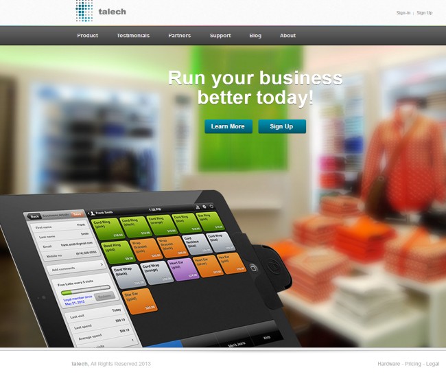
Image Credit: Digital Tonic
Umm…what are you selling?
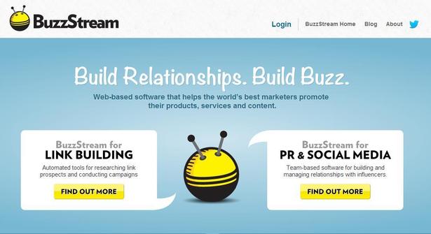
Image Credit: Digital Tonic
Much Better.
8. Autoplay Video And Audio
Just think about it for a moment – have you ever left a site because you were annoyed by the music or video? I certainly have.
People want to decide for themselves when and if they want to watch a video or listen to an audio.
At the end of the day, it’s just super annoying. So if you’ve set your videos to autoplay turn them off. Your visitors will thank you for it.
9. Content is Outdated
Having old content on your site can be a surefire way to lose visitors for good. If you regularly post and you have tons of old archives along with equally as much new content you are fine. But make sure if all the visitor sees is outdated posts that you update them.
People are interested in reading new content. They want to know about the ‘latest’ and the ‘greatest’.
Ankit Oberoi says that while there is no definitive research regarding the frequency of posting, it’s still important not to keep your visitors guessing when your next piece of content will be published. An ideal frequency depends on your niche. As well you should consider that posting too much can also be irritating and may cause them to unsubscribe.
An editorial calendar can be extremely helpful. You can plan out your content over the course of longer time periods. Not only will this ensure that you are posting frequently, but also by planning the topics in advance you can ensure a wide variety of content. Tools like KudaniCloud make creating an editorial calendar incredibly easy.
10. Hard to Read
Gone are the days of small fonts. No one wants to constantly be playing around with the zoom feature on their browser. And what about colours, font family, etc., etc. it all plays a role.
Gent Ukehajdaraj from Speedway Interactive recently discussed this issue. Here’s what he had to say:
Real difficulties begin when visitors start reading your content and realize they have to take some effort to read your content because the font is too small, too big, too bright, doesn’t blend with the background color. This is something you should fix as soon as possible.
Make sure the font is easy to read and is “eye friendly”. From personal experience, when I visit some website that has implemented a font that hurts my eyes, no matter how pretty it looks, I eventually (quite fast) get annoyed and switch to other websites.
If you haven’t already heard, there’s a whole branch in design that focuses on readability and choosing the right font. It’s called typography. The mere existence of typography is a great hint on how important readability is and if you are unsure about choosing the right font for your website, you can always check out online resources on this topic, such as Hubspot’s How to Choose the Right Fonts for Your Marketing article.
11. Questioning Credibility & Trust
Building a website is pretty easy and almost anyone can do it, including those that may not have your best interest at stake.
I’m sure you’ve heard some of the horror stories. People losing their money. Products not arriving. Personal data being stolen or sold.
Clearly trust is an incredibly important factor.
Users are smart and they will look at every part of your site with a critical eye. And believe me if there is anything that screams red flag they will be running.
Cody Miller, from CrazyEgg, says they’ll be looking for these two things:
- Proof that your website is legitimate and trustworthy.
- Proof that it isn’t.
You need to be able to build trust almost instantly.
Here are some tips from CrazyEgg:
Third party validation tells users that your website is secure. The SEO Tool website (pictured below) demonstrates this by including a badge that says their website is “Verified & Secure” according to GoDaddy.com.
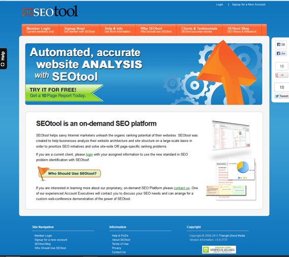
Image Credit: CrazyEgg
It doesn’t really matter whether or not users have ever heard of GoDaddy, what matters is that a user sees third party validation—validation from an outside source.
Furthermore, the website is connected to social media. The sidebar has links to Facebook, Google, and Twitter. These names are recognizable and demonstrate that the website has nothing to hide. This is a public website, active in social media, and that smells trustworthy!
Also, notice that there are several ways in which a user can get help from the website:
- Once in the footer section
- Again on the side
- Also on the top menu bar
12. Broken Links
Nothing can be more frustrating than clicking on a link that doesn’t work, especially when it’s critical information. Broken links and 404 error pages not only make a site look messy and unmaintained but create a huge headache for users.
Make sure to check your links and use a plugin that actively monitors them. This way you can get real time notifications if an error occurs.
Analytics to Consider
When visitors are leaving your site there are two distinct metrics that you want to consider – bounce rate and exit rate.
A recent article from Business2Community explained that these two metrics can often be confused with each other and clarification of their differences is one of the most popular questions asked concerning Google Analytics.
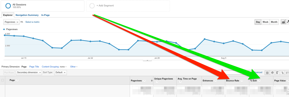
Image Credit: Business2Community
So, the exit rate is the percentage of visitors who viewed a few pages of your website and then left. The key difference between bounce rate and exit rate is that the exit rate concerns multi-page sessions. The exit rate pertains to users who viewed more than one page during a single session and finished exploring on that particular page. However, similarly to bounce rate, it can also reveal some on-page trouble areas, so it should be evaluated in a navigational context as well.
What Is A Good Bounce Rate?
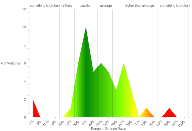
Image Credit: QuickSprout
Neil Patel from QuickSprout says that, “the average bounce rate across all industries is about 45%. Bounce rates just for blogs are usually higher as illustrated in the image above. But that’s just the average. Some sites have bounce rates in the 20s, while others have bounce rates in the 80s. If 4 out of 5 visitors leave your site immediately, there’s a problem—likely multiple problems.”
In Conclusion
Having a great looking site is simply not enough. You need to make sure that you’ve taken into consideration all of the factors that may be causing visitors to bounce. Make small changes and continually monitor your analytics. And get your friends to do some testing for you. Having more eyes on your site is always better than you alone as it might reveal something super small that you may be missing.


